Advanced Typography - Exercises

Chan Qian Hui (0334447)
Advanced Typography
Exercises
LECTURE NOTES
Lecture 1 : Briefing
26/8/2019 (Week 1)
For our first class, we were introduced to this module 'Advanced Typography' by Mr. Vinod and Mr. Shamsul. We started out by dividing the class into 4 groups, and each group had to prepare a presentation for 2 of the typographic systems assigned by the lecturers.
The 8 Typographic Systems are Axial, Radial, Dilatational, Random, Grid, Modular, Transitional, Bilateral
After each presentation, we had a Q&A session for each group. It was quite an interesting session because I learnt a few things such as the differences between each typographical systems, how each systems have phases and methods to create them even though it could be a random design. One of the interesting takeaways was the difference between a grid system and a modular. Both of them are very similar but the difference is that the grid system moves information within the given space while the modular system moves the units of space together with the information.
Lecture 2 : No Lecture
2/9/19 (Week 2)
There was no lecture today. Feedback session for exercise 1 was conducted and Mr Vinod gave briefing for the next exercise. I was absent for the lecture.
There was no lecture today. Feedback session for exercise 1 was conducted and Mr Vinod gave briefing for the next exercise. I was absent for the lecture.
Lecture 3 : No Lecture
9/9/2019 (Week 3)
There was no lecture today. We were given feedbacks on our dissected letters and also briefing for our final exercise.
There was no lecture today. We were given feedbacks on our dissected letters and also briefing for our final exercise.
16/9/2019 (Week 4)
There was no class due to public holiday.
Lecture 5 : Typographic Perception & Organization
23/9/2019 (Week 5)
The lecture for today was given by our fellow classmates on typographic perception & organizaition.
INSTRUCTIONS
EXERCISES
(1) Typographical Systems
For our first exercise, we were required to explore the 8 typographic system and apply it in our exercise. We were tasked to create 2 layouts for each typographic system which in total is 16 layouts for our exercise 1. Mr Vinod pointed that we were required to create out layout on a size 200 x 200 mm spread. In addition to black, we can only use one other colour and graphical elements such as lines and dots can be used but limitedly.
Information to be included in the exercise:
The Design School,
Taylor’s University
All ripped up: Punk Influences on Design
Open Public Lectures:
November 24, 2019
Lew Pik Svonn, 9AM-10AM
Ezrena Mohd., 10AM-11AM
Suzy Sulaiman, 11AM-12PM
November 25, 2019
Muthu Neduraman, 9AM-10AM
Fahmi Reza, 10AM-11AM
Fahmi Fadzil, 11AM-12PM
Lecture Theatre 12
First attempt :
 |
| Fig 1.0 Axial System First Attempt |
 |
| Fig 1.1 Dilatational System First Attempt |
 |
| Fig 1.2 Bilateral System First Attempt |
 |
| Fig 1.3 Grid System First Attempt |
 |
| Fig 1.4 Radial System First Attempt |
 |
| Fig 1.5 Random System First Attempt |
 |
| Fig 1.6 Transitional System First Attempt |
 |
| Fig 1.7 Modular System First Attempt |
After getting feedback from Mr Shamsul, I made adjustments to my layouts.
After readjustments :
 |
| Fig 1.8 Final Axial System |
 |
| Fig 1.9 Final Dilatational System |
 |
| Fig 1.10 Final Bilateral System |
 |
| Fig 1.11 Final Grid System |
 |
| Fig 1.12 Final Radial System |
 |
| Fig 1.13 Final Random System |
 |
| Fig 1.14 Final Transitional System |
 |
| Fig 1.15 Final Modular System |
 |
| Fig 1.16 Axial system #1 |
 |
| Fig 1.17 Axial system #2 |
 |
| Fig 1.18 Dilatational system #1 |
 |
| Fig 1.19 Dilatational system #2 |
 |
| Fig 1.20 Bilateral system #1 |
 |
| Fig 1.21 Bilateral system #2 |
 |
| Fig 1.22 Grid system #1 |
 |
| Fig 1.23 Grid system #2 |
 |
| Fig 1.24 Radial System #1 |
 |
| Fig 1.25 Radial System #2 |
 |
| Fig 1.26 Random system #1 |
 |
| Fig 1.27 Random system #2 |
 |
| Fig 1.28 Transitional system #1 |
 |
| Fig 1.29 Transitional system #2 |
 |
| Fig 1.30 Modular system #1 |
 |
| Fig 1.31 Modular system #2 |
(2) Type & Play
We were tasked to make a selection of image between man-made objects (chair, glass, etc.) or structures (buildings), and nature (Human,landscape, leaf, etc). We will have to analyse, dissect and identify potential letter forms within the dissected image. The forms would be explored and ultimately digitized. It is expected that through a process of iteration the forms would go from crude representation to a more refined celebration that would reflect to a degree its origins.
For this exercise, I chose a picture of wall cracks. I find the characteristic of the cracks to be interesting and I could see letters which I could extract from as well.
Image chosen :
Image chosen :
 |
| Fig 2.0 Picture of wall crack found online |
Dissection of picture and finding type :
 |
| Fig 2.1 Dissection of picture |
Process of Refining Text :
 |
| Fig 2.2 Letters extracted |
 |
| Fig 2.3 Process of refining text |
The first feedback I received regarding the refining is that I should do more research regarding cracks, such as it should be larger at intersecting points and becomes narrower as it extends out. I should also refer to the typeface which I am aiming for to not lose direction during refining.
 |
| Fig 2.4 Process of refining text |
 |
| Fig 2.5 Process of refining text (refer to Garamond typeface) |
 |
| Fig 2.6 Process of refining text (adjusting size of letters with baseline) |
 |
| Fig 2.7 Process of refining text |
I realized that although I implemented what I analyzed from wall cracks into the letters, the letters looked too similar to tree branches, it was quite hard to differentiate them so I added some contrast to give depth.
 |
| Fig 2.8 Process of refining text (adding shadows) |
 |
| Fig 2.9 Initial attempt of type & play |
The feedback which I gotten from Mr Vinod was that I could change the shadows into outlines and change to white.
For the concept, I wanted to use the recent haze issue as my topic so I chose a picture of a kid wearing facial mask since everyone is wearing facial mask to protect from the haze. The text I chose for the exercise is "Haze no matter who cause it, everyone suffers."
Final type & image :
Week 2:
Week 3:
Week 4:
Week 1

Typographic Design: Form & Communication is the definitive reference for graphic designers, providing a comprehensive introduction to the visual word. Done well, typography can communicate so much more than the words themselves. Typographic design determines how you feel about a message, the associations you make, and ultimately, the overall success of the communication. Typographic design extends from the page to the screen, and is a critical element of almost any graphic design project. This book provides essential guidance on everything related to type: from letterforms and negative space, to messaging, processes, and history, aspiring designers will find great utility in mastering these critical concepts.
Final Type & Play :
 |
| Fig 2.10 Final attempt of type & play (with baseline) |
 |
| Fig 2.11 Final attempt of type & play |
 |
| Fig 2.12 Final letter "E" |
 |
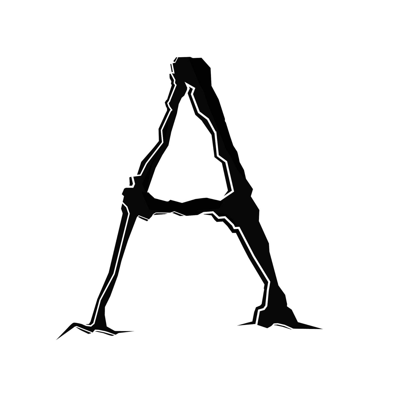
| Fig 2.13 Final letter "A" |
 |
| Fig 2.14 Final letter "T" |
 |
| Fig 2.15 Final letter "O" |
 |
| Fig 2.16 Final letter "F" |
Final Exercise : Type & Image
For our final exercise we were required to find an image of a man-made structure or object, and nature will be combined with a letter/word/sentence. The objective is to enhance/support the interplay between the letter/word/sentence and the selected image. The text must be woven into a symbiotic relationship with the image.
For our final exercise we were required to find an image of a man-made structure or object, and nature will be combined with a letter/word/sentence. The objective is to enhance/support the interplay between the letter/word/sentence and the selected image. The text must be woven into a symbiotic relationship with the image.
For the concept, I wanted to use the recent haze issue as my topic so I chose a picture of a kid wearing facial mask since everyone is wearing facial mask to protect from the haze. The text I chose for the exercise is "Haze no matter who cause it, everyone suffers."
 |
| Fig 3.0 Image sourced online |
 |
| Fig 3.1 Process of type & image |
 |
| Fig 3.2 Adding distortion to words |
 |
| Fig 3.3 Smudging and fading words |
 |
| Fig 3.4 Refining type & image |
After receiving feedback from Mr Vinod, I made a few final adjustments to my type & image exercise.
 |
| Fig 3.5 Final type & play |
FEEDBACK
Week 1 :
Week 1 :
We did not receive any feedback for the first class.
Week 2:
Specific Feedback :
Axial : Mr Shamsul said that the negative space was too odd. Besides that the axis was too diagonal and could be tilted more to reduce the tension.
Radial : it was overall okay.
Bilateral : Mr Shamsul said there was too much negative space and too mcuh stress at the bottom. For the second layout it was okay but i should create paragraph spacing
Random : Mr Shamsul said the first random layout was still a bit structred for the names, can still increase randomness. The second one could place the details at the bottom to avoid too much stress at the top.
Grid : it looks okay but I should be careful to not place information at the gutter.
Modular : I should not overlap the cells and it was a bit too messy
Transitional : it looks okay but the movement can be improved
Dilational : it was overall okay
Week 3:
General Feedback :
Mr Vinod told us to remember to always refer to the typeface we chose and work towards it. Besides that, Mr Vinod also told us to analyze the characteristics of the picture we chose so we could imply it into the letters.
Specific Feedback :
Specific Feedback :
Mr Vinod told me to analyze more of the characteristic of the cracks that could be implemented in the letters. For example, cracks are normally bigger at the point where they intersect and thinner as it extends. Also I was told to constantly refer to the typeface which I chose as well. Besides that Mr Vinod also told me to place the letters together so I could put a baseline to keep the letters consistent.
Week 4:
Specific feedback :
There was no class this week so I got feedback from Mr Shamsul for my first exercise :
Axial : overall fine
Dilatational : The first layout words can be split into more circles instead of cramping all in one
Bilateral : The second layout is too diagonal, maybe can shift a little bit more.
Grid : The words should not be inside the gutter, it could be either be smaller or extended
Radial : overall fine
Random : overall fine
Modular : If I want to overlap the circles, the grids should either be smaller so the circles can be larger and extend to intersect, or else I should keep the circles in the grids.
Week 5 :
General Feedback :
Mr Vinod said that when we refine our letters, we should not forget the initial characteristics which we want to implement in the letters. We should have a core element or characteristics of the image which we dissected from and maintain it throughout the process of refining our letters. Refining the letters means we should either add or minus elements from the dissected letters, but we should not remove the initial characteristics.
Specific Feedback :
For my letters, Mr Vinod said the grey part can be changed into white outlines and thicken it to create a better effect. I should also take note that since the effect is not very thick, when the font size becomes smaller, the effect won't be obvious so it limits the minimum font size for my letters. For the type and image, Mr Vinod commented that the words at the bottom does not really need distortion. It could be kept straight and fade up to create contrast with the title as the title is already distorted. Overall, Mr Vinod said he likes it.
For my letters, Mr Vinod said the grey part can be changed into white outlines and thicken it to create a better effect. I should also take note that since the effect is not very thick, when the font size becomes smaller, the effect won't be obvious so it limits the minimum font size for my letters. For the type and image, Mr Vinod commented that the words at the bottom does not really need distortion. It could be kept straight and fade up to create contrast with the title as the title is already distorted. Overall, Mr Vinod said he likes it.
REFLECTION
Week 1
- Experience - I was quite surprised that we were suddenly tasked to give a lecture in the class. I hoped we had more time to research and understand more about the typography systems before giving a lecture and applying in to our exercises.
- Observation - I observed how compared to semester one, my classmates were more mature and analytical about their knowledge in typography during the Q&A sessions.
- Findings - I found out that sometimes students preparing for a lecture are not properly understanding or analyzing their materials before putting in slides. They would just source out from the website and read from the slides. I found out that the 45 minutes lunch break was quite rushed because it is during the lunch hour and we had to rush everything in 45 minutes.
Week 2 :
- Experience - I wasn't able to attend the class for this week because I was overseas. I realized that I left out quite a lot of things like feedbacks and lectures. This caused me to be quite lost when I was working on the next exercise as I had to constantly ask my classmates.
- Observations -
- Findings - I found out that the amount of information that I have missed due to one class is a lot and impacts on my exercises as well. Besides that it was quite a hassle for me trying to get feedbacks from Mr Vinod.
Week 3 :
- Experience - I felt relieved because I was able to work on my next exercise smoothly because I did research and I was also able to further improve and progress on my work following Mr Vinod's advices. Although I might not be doing very well compared to others or refine my letters as much as my seniors I did, I was relieved that I was able to work on my exercise steadily. However I was still quite anxious about my first exercise because it wasn't fully approved yet. I wish I could have some time to let Mr Vinod review my work.
- Observations - I was quite surprised with the progress that I made with my work. I realized I wasn't refining the characters enough but I have a clear goal in mind on what should I work on. I was also worried for some of my friends because they were struggling in finding their characteristics in their letters.
- Findings - I realized that oftentimes even in class we have to take time to queue and meet with Mr Vinod to review on our work. Due to the class size, despite having class from 8am to 2pm, the amount of feedback we could get from Mr Vinod is still very limited, I wish we could have a one-to-one session with Mr Vinod or even have some time to make an appointment with Mr Vinod.
Week 4 :
- Experience - This week as there was no class. It was quite tough for me to get any sort of feedback from Mr Vinod. I felt that I could not progress much cause I didn't knew how my work was and whether if I should change or improve anything. It was quite difficult cause I tried to stop overly depend on Mr Vinod's feedbacks and try to analyse and dissect my own work so I could further improve on it.
- Observations - I realized since I wasn't able to get feedback from Mr Vinod. I took more time analysis and trying to dissect my artwork. Although it was quite effective in the beginning, I couldn't really find any problem after looking at it repeatedly, so I had to take a break before reviewing my work. I also asked a few of my friend's opinion about my work and further improve based on what their feedbacks.
- Findings - I found that we were quite dependent on Mr Vinod's feedback and this resulted us in unable to progress and further work on our project. We should learn how to dissect and view at our work so when we work independently in the future, we can understand our own work and know where to improve. I also realized we should read more in order to gain more knowledge which could help us in understanding and analyzing our own work.
Week 5
- Experience - For this week, I was quite glad that my exercises were completed in time and had few small adjustments to make only. This allowed me to take time to focus on my project one. I was quite shocked in the beginning when I first found out we are using the same title as our seniors. I didn't really like it because I knew many of us including me were going to get influenced by our seniors artwork. I was actually quite looking forward to using our first exercise titles as our project 1 title since we already took time to work with the title and content in different systems and sort of getting comfortable with it.
- Observation - I found out that most of my classmates were really good and took a lot of efforts into their exercises. Some had 5 to 6 stages of refining their text which really amazed me. I also found out that all of my classmates became really good at creating fonts and each had a really distinct characteristics to it. I also realized that since there was so many people in the class Mr Vinod took some time to check through our work and over time the feedback became shorter to save time.
- Findings - I found out that I was slightly irritated because I spent quite some time looking through our seniors work and analyzing their work more instead of taking time to explore the meaning of the title. Due to this, I realized the area of my exploration became narrower and I ended up focusing on thinking how to work better than the benchmark given than properly analyzing the title and the message that I wish to convey.
FURTHER READING
7 Essential Typographic Layout Systems by Lucas Czarnecki

This is a really good e-book to learn about the fundamentals of typographic layout systems. It gives a straightforward and simple explanation and also provide examples for readers to understand the context better. Not just that, it also guides readers on how to improve your layout design for each typographic layout to make it more interesting and complex. Overall, it is a highly recommended e-book for people who are clueless to learn about typographic layout systems.
Typographic Design : Form and Communication (7th edition) by Rob Carter, Sandra Maxa, Mark Sanders, Philip B. Meggs, Ben Day

Typographic Design: Form & Communication is the definitive reference for graphic designers, providing a comprehensive introduction to the visual word. Done well, typography can communicate so much more than the words themselves. Typographic design determines how you feel about a message, the associations you make, and ultimately, the overall success of the communication. Typographic design extends from the page to the screen, and is a critical element of almost any graphic design project. This book provides essential guidance on everything related to type: from letterforms and negative space, to messaging, processes, and history, aspiring designers will find great utility in mastering these critical concepts.


Comments
Post a Comment