Typography - Exercises

Chan Qian Hui (0334447)
Typography
Exercises
LECTURE NOTES
Lecture 1 : Briefing5/4/2019 (Week 1)
For the first week of Typography lecture, we were briefed about our module information booklet and introduced us to our assignments throughout the semester for Typography. During the lecture, Mr Vinod and Mr Shamsul also guided us on creating our own e-portfolio and told us about the importance for designers to have their own portfolios. He emphasized that it is important for us to update on the blog every week so we are able to keep track on our work and understand about what we are learning.
Lecture 2 : Introduction to Typography
12/4/2019 (Week 2)
Mr Vinod started the lesson by asking us "what is typography". He told us that typography includes calligraphy, lettering, composition and design principles. Typography should be applied in an effective meaningful way with ethical considerations. For example, a good typography in a textbook could affect how the learner would learn. He also told us to forget what we knew about typography previously and asked us to set our benchmark not by what we saw, but by what we are going to see.
Mr Vinod said "as designers, we should not just look, we should analyze, evaluate and dissect the design"(visual analysis). He emphasized that we should write, put down ideas into words and making use of terminology in order to explain own's design with the right terms. He also introduced us to terminologies such as font, typeface and type family.
Important terminology in typography :
- Font - refers to the individual font or weight within the typeface
- Typeface - refers to the entire family of fonts that share the same characteristic.
- Typefamily- a type family refers to the many weights within an individual typeface.
19/4/2019 (Week 3)
For this week's lecture, we were taught about the terms for letterforms. We learnt about the basic structure of letterform which were made of strokes. We also learnt some terms such as Baseline, Median, x-height, Apex, Arm and many others.
These are parts that every designer should be aware and make good use of, not just repeatedly using certain structures due to the visual aesthetics.Mr Vinod also taught that the upper case is used to start a word and lower case is used to write fonts. If we wish to use uppercase throughout a sentence, we should use small capitals. A typeface has 2 goals Easy Readability Appropriate expression of contemporary aesthetic.
After the lesson, he told us to download 9 typefaces which we are going to use throughout our semester for all assignments and exercises, which are
- Garamond
- Janson
- Caslon
- Baskerville
- Bodoni
- Serifa
- Futura
- Gill Sans
- Univers
Lecture 4 : Development and Timeline of Typography
26/4/2019 (Week 4)
For week 4, we covered on the development and timeline of typography. Initially, writing was just scratching into wet clay with sharpened sticks or cravings into stones. Throughout the years, forms of uppercase can be seen to evolve as only uppercase was used in the olden times.26/4/2019 (Week 4)
The Phoenicians began the development of early letterforms, uppercase that are simple combination of straight lines and pieces of circles which was written from right to left. Then the Greeks changed the direction of writing, which became left to right called "boustrophedon". Etruscan (and then Roman) carvers worked in marble painted letterforms before inscribing them. This caused certain qualities of their strokes to change from vertical to horizontal, broadened the stroke at start and finish and carried over into the carved letterforms.
 |
| Fig 1.0 Evolution of letterforms (Phoenician - Roman) |
Hand script from 3rd – 10th century C.E. :
Square and Rustic capitals are typically used for documents or intended performance.
For everyday transactions, cursive writing were used for speed. Due to that, it became the beginning of lowercase letterforms. Charlemagne, the first unifier of Europe since the Romans standardized all ecclesiastical texts. He entrusted this task to Abbot who did most of the writings. But with the dissolution of Charlemagne’s empire, different regions started having their variations of letterforms. Nowadays, typeforms are being changed due to technology, commercial words and aesthetic trends.
I chose dog as dogs are energetic, loud and fun which I wanted initially as my personalities.
I've designed different typefaces but I realized that although visually it looked cute, but it was more of a doodle art instead of a letter design.
Besides that, I also realized that the visual communication wasn't obvious enough as it failed to show my personalities and there wasn't a specific personality that I was trying to portray.
Mr Vinod also gave similar feedback on my work and thus I've decided to change my choice of personality for the design.
Week 2 : Digitization of Lettering
While sketching, I realized one of the lettering stood out a lot compared to others as the shape and motion of the design was striking and obvious.
Digitized Lettering :
I compared both of my digitized lettering and chose design A because it was neat and simple while still able to show the movement of jumping and happiness which fits "Exuberant".
Second attempt :
For the second attempt, I've expanded the size of the letters to improve the motion of jumping. I've also added lines for the smiley face at the end to improve the happy mood.
The animation for the second GIF was smoother compared to the first GIF but the movement of the lettering still felt weird as if it was floating upwards and not jumping.
The motion of the letter "H" and "I" still needs further adjustment to make the movement smoother.
Final GIF :
For the third attempt, I flattened the lettering before it jumps, elongated the lettering after it jumped and made it thinner and slowly expand to improve on the jumping motion. I measured and adjusted the position of the letter "H" and "I" in every frame to make sure it does not move out of position.
Besides that, I've also made the eyes popped after the jumping motion to show energy and excitement.
The animation for the final GIF is smoother and the jumping motion is more obvious and cleaner compared to the first two.
A few reasons why I chose this animation :
For this exercise, we were required to express the these seven words - Angry, Bounce, Loop, Levitate, Hungry, Faint, Freeze using only a 10 group of typefaces. We were not allowed to distort any of the letters, we were only allowed to rotate, flip or scale them proportionally. After designing, we have to choose the 6 as the final type expressions.
Sketches :
First Attempt :
After showing Mr Vinod, he pointed out a few things which I should take note of :
Although the words were approved by Mr Vinod, I still wasn't pretty satisfied with the word "Angry" because it didn't seem angry enough and the lines does not enhance the angry emotion enough. So I further improved on it.
Final Type Expression :
Animation of Type Expression :
After the final 6 type expression is done, we were required to animate one of the type expressions. I chose "Bounce" because I really liked the design of that type expression out of my 6 type expressions. Besides that, I was also able to visualize the movement of the letter "O" which bounces from left to right.
First attempt :
After showing Mr Vinod my GIF, he said that the bouncing effect was too compressed and I should refer to some other students.
Second attempt :
The bounce letters which appeared after the bouncing effect seemed too static and does not really enhance the bouncing motion. Thus, I decided to add a fade away effect at the words to create a realistic effect to the bouncing motion.
Specific Feedback :
Mr Vinod said that my design did not really showed my personality as the concept of my personality was not clear enough and should be just one personality but not something that I like. He also told me to make use of the spaces of the fonts such as mouths to make the personalty more obvious.
General Feedback :
Mr Vinod reminded us to update our E-portfolios constantly as it is important for us to keep track of what we are doing.
Week 4 :
General feedback :
Mr Vinod mentioned a few rules that we should obey for the feedback form. First, we should not delete other's feedback. Second, we are not allowed to change the typeface, it should be Ariel 10pts. Third, we are not allowed to deleted the red tags.
This book is really interesting as it relates typography into our everyday situations. It is also presented in a really fun way with simple terms and plenty of pictures which we can see everywhere in our daily lives.
The book is a compilation of typography works by different artists with designs such as
3 Dimensional typography, typography as pictures, the composition of typography, the optical effects of typography, hand-drawn typography, typography and logo design. The book is graphic-focused and have a minimal amount of text. Through this book, I have learnt and seen how designers take a lot attention to details and how a tiny adjustment is able to change the overall concept and design. I've also able to get inspiration and learnt how different designers work.
Square and Rustic capitals are typically used for documents or intended performance.
For everyday transactions, cursive writing were used for speed. Due to that, it became the beginning of lowercase letterforms. Charlemagne, the first unifier of Europe since the Romans standardized all ecclesiastical texts. He entrusted this task to Abbot who did most of the writings. But with the dissolution of Charlemagne’s empire, different regions started having their variations of letterforms. Nowadays, typeforms are being changed due to technology, commercial words and aesthetic trends.
INSTRUCTIONS
EXERCISE
Week 1 : Lettering
We were asked to choose one personality that represents our own self and design a typeface for our own nickname or first name. I listed down a few personalities which I had that are : energetic, fun, extrovert, noisy, loud. In the beginning I couldn't decide on just one personality and thus I decided to use something to represent me.
We were asked to choose one personality that represents our own self and design a typeface for our own nickname or first name. I listed down a few personalities which I had that are : energetic, fun, extrovert, noisy, loud. In the beginning I couldn't decide on just one personality and thus I decided to use something to represent me.
I chose dog as dogs are energetic, loud and fun which I wanted initially as my personalities.
 |
| Fig 2.0 Idea sketching for lettering (Personality : Dog) |
I've designed different typefaces but I realized that although visually it looked cute, but it was more of a doodle art instead of a letter design.
 |
| Fig 2.1 First concept sketches of lettering design (Personality : Dog) |
 |
| Fig 2.2 Second concept sketches of lettering (Personality : Dog) |
Besides that, I also realized that the visual communication wasn't obvious enough as it failed to show my personalities and there wasn't a specific personality that I was trying to portray.
Mr Vinod also gave similar feedback on my work and thus I've decided to change my choice of personality for the design.
Week 2 : Digitization of Lettering
After week 1, I've started focusing on using just one personality on one lettering and sketched around to compare and see which was able to portray the personality the best.
 |
| Fig 3.0 Sketches (personalities : energetic, curious and loud) |
I tried to sketch more to compare the designs and take the parts which are able to show the personality and further develop the lettering design.
 |
| Fig 3.1 further sketches of lettering (personalities : energetic, noisy and curious) |
While sketching, I realized one of the lettering stood out a lot compared to others as the shape and motion of the design was striking and obvious.
The design was based on the personality "energetic" and it was in a popping motion to show movement and fun.
 |
| Fig 3.2 sketch (personality : energetic) |
Using the same concept, I decided to emphasis on the movement and added some curves to show dancing movements and added dots to the letter 'U' to show a smiley face which shows happiness.
I also changed my name from "Qian" to "Hui" as it was quite difficult to work with the letter "Q" and "Hui" is simpler and easier to remember.
 |
| Fig 3.3 Final sketches of lettering (personality : energetic) |
After some research, I've decided to use the word 'Exuberant' instead of energetic which means full of energy, excitement, and cheerfulness as the design concept for my lettering. This relates better to my lettering concept and the idea is clearer compared to before.
Digitization of my work :
Digitization of my work :
 |
| Fig 3.4 Screenshot of digitization process (Design A personality : Exuberant) |
 |
| Fig 3.5 Screenshot of digitization process (Design B personality : Exuberant) |
Digitized Lettering :
 |
| Fig 3.6 Digitized lettering for personality "Exuberant" (Design A) |
 |
| Fig 3.7 Digitized lettering for personality "Exuberant" (Design B) |
I compared both of my digitized lettering and chose design A because it was neat and simple while still able to show the movement of jumping and happiness which fits "Exuberant".
|
| Fig 3.8 Final Chosen Lettering (Personality : Exuberant) |
Week 3 : Animating Lettering
After completing the static lettering, we were tasked to animate our lettering which would portray our personality even more using Adobe Illustrator and Adobe Photoshop. We had to shift and adjust the animation frame by frame using Adobe Illustrator and convert the art boards to Adobe Photoshop and create a frame animation to create a GIF.
As my personality is Exuberant, I've decided to add a jumping motion which bounces from the bottom and springs up full of energy, and the letter "H" and "I" pops away leaving the smiley face at the center.
First attempt :
I did a rough animation during the first attempt to help me better visualize the animation outcome.
My first attempt turned out to be quite static as the jumping movement of the words and spreading of letter "H" and "I" was too static and not smooth enough. So I decided to further improve on it.
As my personality is Exuberant, I've decided to add a jumping motion which bounces from the bottom and springs up full of energy, and the letter "H" and "I" pops away leaving the smiley face at the center.
First attempt :
I did a rough animation during the first attempt to help me better visualize the animation outcome.
 |
| Fig 3.0 First attempt of GIF (Personality : Exuberant) |
My first attempt turned out to be quite static as the jumping movement of the words and spreading of letter "H" and "I" was too static and not smooth enough. So I decided to further improve on it.
Second attempt :
For the second attempt, I've expanded the size of the letters to improve the motion of jumping. I've also added lines for the smiley face at the end to improve the happy mood.
 |
| Fig 3.1 Second attempt of GIF (Personality : Exuberant) |
The animation for the second GIF was smoother compared to the first GIF but the movement of the lettering still felt weird as if it was floating upwards and not jumping.
The motion of the letter "H" and "I" still needs further adjustment to make the movement smoother.
Final GIF :
Besides that, I've also made the eyes popped after the jumping motion to show energy and excitement.
 |
| Fig 3.2 Screenshot of progress work for GIF (Personality : Exuberant) |
 |
| Fig 3.3 Final GIF (Personality : Exuberant) |
The animation for the final GIF is smoother and the jumping motion is more obvious and cleaner compared to the first two.
A few reasons why I chose this animation :
- It expresses the fun, joy emotion and active movement for my personality "exuberant"
- The jumping motion showed a high amount of energy.
- Instead of letting the whole letter fall back, I made it pop out to maintain the high energy
- The smiley face only dropped at the center instead of the very bottom to keep the energy level.
- The smiley face at the end was to emphasis on happiness.
For this exercise, we were required to express the these seven words - Angry, Bounce, Loop, Levitate, Hungry, Faint, Freeze using only a 10 group of typefaces. We were not allowed to distort any of the letters, we were only allowed to rotate, flip or scale them proportionally. After designing, we have to choose the 6 as the final type expressions.
Sketches :
 |
| Fig 4.0 Sketches for "Loop" |
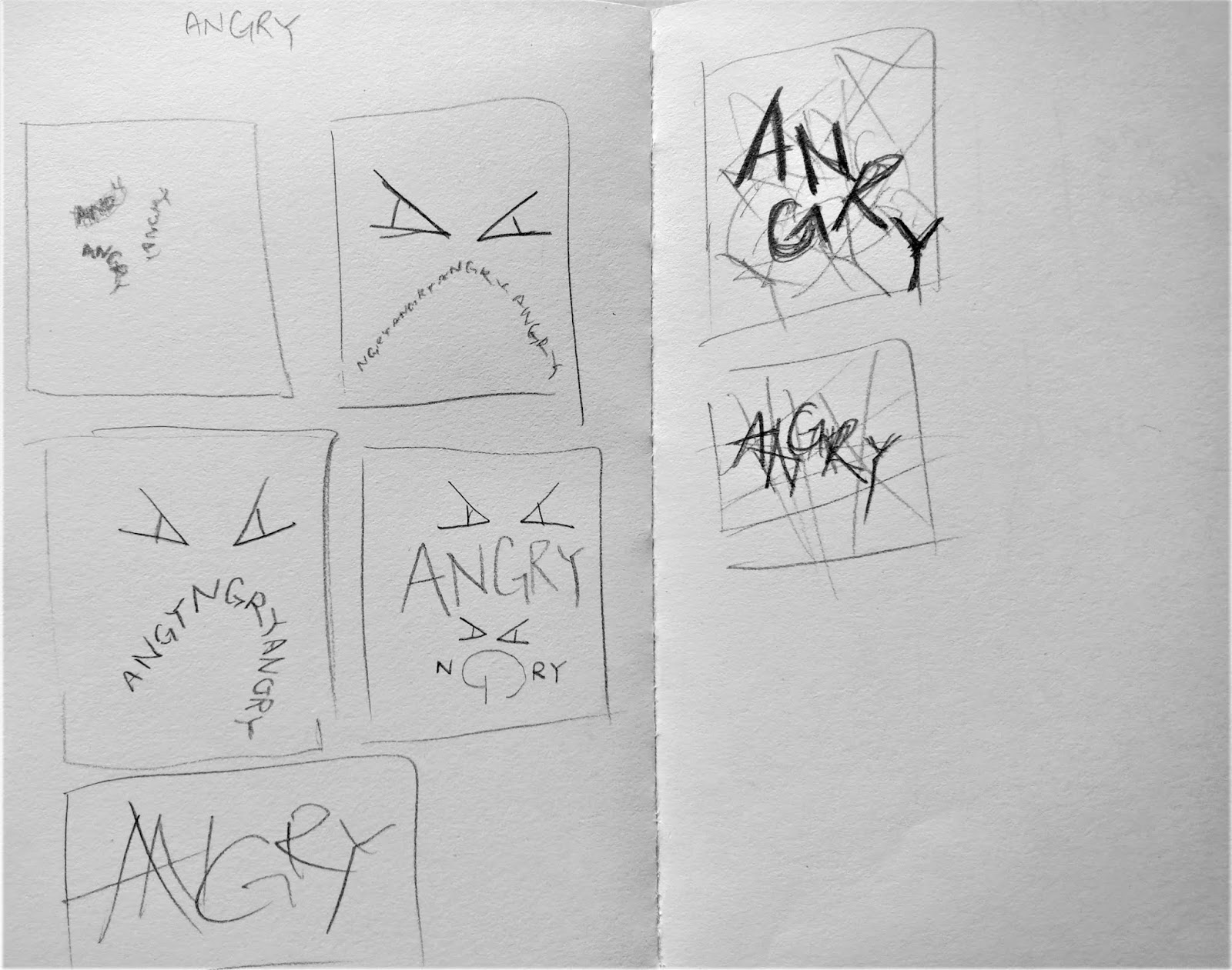 |
| Fig 4.1 Sketches for "Angry" |
 |
| Fig 4.2 Sketches for "Bounce" |
 |
| Fig 4.3 Sketches for "Faint" |
 |
| Fig 4.4 Sketches for "Levitate" |
 |
| Fig 4.5 Sketches for "Hungry" |
 |
| Fig 4.6 Sketches for "Freeze" |
First Attempt :
 |
| Fig 4.7 Initial attempt of type expressions (Angry, Freeze, Bounce, Faint, Loop, Levitate) |
 |
| Fig 4.8 Type expression for "Hungry" |
After showing Mr Vinod, he pointed out a few things which I should take note of :
- Angry - The expression is too dependent on the lines, the colour of the lines should be lighter
- Freeze - The small arts need to be removed and the words should be stuck together like a block of ice
- Bounce - is alright
- Faint - Overall looks too much like spinning
- Loop - is alright
- Levitate - levitate is not floating up but just slightly lifted, I should check up on the meaning of levitate.
Second Attempt :
 |
| Fig 4.9 Second attempt of type expression (Angry, Freeze, Bounce, Faint, Loop, Levitate) |
Although the words were approved by Mr Vinod, I still wasn't pretty satisfied with the word "Angry" because it didn't seem angry enough and the lines does not enhance the angry emotion enough. So I further improved on it.
Final Type Expression :
 |
| Fig 4.10 Final type expression (Angry, Freeze, Bounce, Faint, Loop, Levitate) |
Animation of Type Expression :
After the final 6 type expression is done, we were required to animate one of the type expressions. I chose "Bounce" because I really liked the design of that type expression out of my 6 type expressions. Besides that, I was also able to visualize the movement of the letter "O" which bounces from left to right.
 |
| Fig 4.11 Chosen type expression : Bounce |
First attempt :
 |
| Fig 4.12 Initial attempt of bounce GIF |
After showing Mr Vinod my GIF, he said that the bouncing effect was too compressed and I should refer to some other students.
 |
| Fig 4.13 Screenshot of progress for second attempt of animation |
Second attempt :
 |
| Fig 4.14 second attempt of bounce GIF |
 |
| Fig 4.15 Screenshot process of bounce GIF |
 |
| Fig 4.16 Final GIF : Bounce |
The bouncing effect looked more natural and after the fade away effect is added. It enhanced the motion of bouncing and increased the sense of direction and attention on the letter "O".
FEEDBACK
Week 2 :
Specific Feedback :
Mr Vinod said that my design did not really showed my personality as the concept of my personality was not clear enough and should be just one personality but not something that I like. He also told me to make use of the spaces of the fonts such as mouths to make the personalty more obvious.
General Feedback :
Mr Vinod reminded us to update our E-portfolios constantly as it is important for us to keep track of what we are doing.
Week 3 :
Specific Feedback :
Specific Feedback :
Mr Vinod said that my letter design was able to express what my personality, as for my animation, Mr Vinod said if the letter is too static, I could try to extend or "grow" the letters in order to make the jumping animation more lively and smoother.
General Feedback :
Mr Vinod said we should constantly save our work progress and don't stop working no matter how bad it is especially during in class so that the lecturers could give us feedback on the spot. We shouldn't give up or be afraid of feedbacks. We should be open-minded no matter how terrible the feedback is in order to keep polishing our skills so that we would have a better outcome.
Week 4 :
Specific feedback :
Mr Vinod said that my "angry" expression was too dependant on the extra lines and I should make the colours for the lines lighter. Besides that, he also told me to put the letters of "freeze" together and remove the extra arts. While for my "faint", it felt as if it was spinning instead of faining.
The other typefaces were fine. For animation, he said that my bouncing felt too compressed and I should refer to some other classmates to understand better
General feedback :
Mr Vinod mentioned a few rules that we should obey for the feedback form. First, we should not delete other's feedback. Second, we are not allowed to change the typeface, it should be Ariel 10pts. Third, we are not allowed to deleted the red tags.
REFLECTION
Week 1 :- Experience - The first lecture was exciting and fun for me because we were introduced to typography which is a really interesting module and topic that is everywhere in our lives. I was quite stressed out because I didn't really knew how to design a font, I ended up doodling and sketching mindlessly.
- Observation - I noticed that Mr Vinod really stresses us students and designers about the fact that we should constantly update our portfolio and we should always write and read. I also noticed that few of my classmates have similar concepts for their name design.
- Findings - I found that it is really important to take note of whatever the lecturer said because we often miss out a lot of important information if we did not note it down. I also find out that it is important to ensure that we keep track of what we're learning so we won't miss out.
- Experience - The second lecture was quite nerve-wrecking as it was the first time my work is being critiqued and I was also stressed by how well my classmates perform as I wasn't really used to using Adobe softwares yet and also digitally doing artworks. I struggled a lot when I realized that my idea behind we design was just not strong enough and I really need to work hard on it.
- Observation - I noticed how most students focused more on the visual aesthetics while Mr Vinod focused more on the visual communication. I also noticed that my classmates are really creative and they perform really well with Adobe softwares.
- Findings - I found out that typography is not just about the visual aesthetics but it is important to have good readability and clear visual communication as the main goal for the typography is to convey the message, which in our exercise is our personality chosen. I also realized that I need to practice more with using Adobe softwares and getting my research and message clear and straightforward before jumping straight into designing.
Week 3 :
- Experience - I enjoyed my third lecture because we learnt how to animate our own letterings. I was quite worried when my animation was way too static and I had a hard time shifting from Adobe illustrator and Adobe Photoshop to fix and improve on my animation.
- Observation - I noticed how it is easier to animate words that are more static and it is harder to animate dynamic and flexible movements especially when it requires a change in direction. I also noticed that it is quite frustrating to constantly shift back from Adobe Photoshop to Adobe Illustrator to fix certain frames for the animation because I had to export all the artboards and store it together again and again.
- Findings - I found out that sometimes removing certain frames would make my animation even smoother because it reduces the delay between each frames. I also found out that all the animation and extra elements that we include into our design must always reflect back to our overall concept. We should avoid moving too far away from our idea.
- Experience - It was a pretty stressed class because instead of our focusing on one typography at a time, now we have to focus on 6 different words at the same time. I was quite stressed out because my design was too similar with my classmates and I was worried that my idea would seem too unoriginal due to that. Besides that I also thought that Mr Vinod might get uninterested in my design due to the similar repeating designs by the students.
- Observation - I realized that most of my classmates have similar design concept for our type expressions. I also realized that because everyone is working on the same theme, the competition sort of arises and it would make a few people's design boring because it is too similar. I think that Mr Vinod was quite bored overtime due to our similar repeating designs in the class.
- Findings - I found out that sometimes in design, less is more. The more we add, the more it only distracts us from the main message that we were trying to convey. I found out that the highlight of the entire design should be on the fonts not the extra elements, the other extra stuffs should only support the font design. It is based on our capability to see how we can portray the meaning of the words by designing only the letters.
FURTHER READING
Stop Stealing Sheep & find out how type works by Erick Speikermann
5/4/2019 - 12/4/2019 (Week 1-2 )
5/4/2019 - 12/4/2019 (Week 1-2 )
 |
| Fig 5.0 Cover of Stop Stealing Sheep & find out how type works |
This book is really interesting as it relates typography into our everyday situations. It is also presented in a really fun way with simple terms and plenty of pictures which we can see everywhere in our daily lives.
Through this book, I learnt that designing typeface for particular purposes is more widespread than most people think. There is a special type for telephone books, small ads, newspaper and Bibles. I also learnt that a good typography is usually hard to be noticed, people will not even notice that every detail and how the way the words are arrange been through many times of consideration by designers. Good design in type will just let the reader read through the passage naturally and be able to focus on reading.
Typographics Play & Work
(a compilation book of typography works by different artists)
19/4/2019 - 26/9/2019 (week 3-4)
19/4/2019 - 26/9/2019 (week 3-4)
 |
| Fig 5.1 Typographics Play & Work |
The book is a compilation of typography works by different artists with designs such as
3 Dimensional typography, typography as pictures, the composition of typography, the optical effects of typography, hand-drawn typography, typography and logo design. The book is graphic-focused and have a minimal amount of text. Through this book, I have learnt and seen how designers take a lot attention to details and how a tiny adjustment is able to change the overall concept and design. I've also able to get inspiration and learnt how different designers work.

his is an awesome article, thank you for sharing.
ReplyDeleteRegards,Animation Studio in Hyderabad
Nice blog!! Thanks for sharing it, it’s really helpful. Are you from a designers kingdom? Do you know that communication plays a vital role in design —it’s essential to establish a clear connection between the website and user and to help your users accomplish their goals. When we talk about communication in a web design context, we usually mean text. Here we are going to explain some of the basic tips on typographyin designing websites
ReplyDelete